OAO
Objective
Provide a complete brand consultation for CBD wellness brand, OAO. Services include logo design, defining brand guidelines, design iconography, custom structural design, packaging layout and creating production ready files. The packaging design should feel trendy and fashionable, yet subtle and feminine. Target customer is between the ages of 25-25, living an active lifestyle with an appreciation for quality skincare routine.
Solution
We [Uneka] established a cross-functional, in-house team of Structural Design, Graphic Design, Project Management and Manufacturing. I was responsible for all branding efforts, design packaging layouts, generating presentation materials, and providing production ready files for manufacturing.
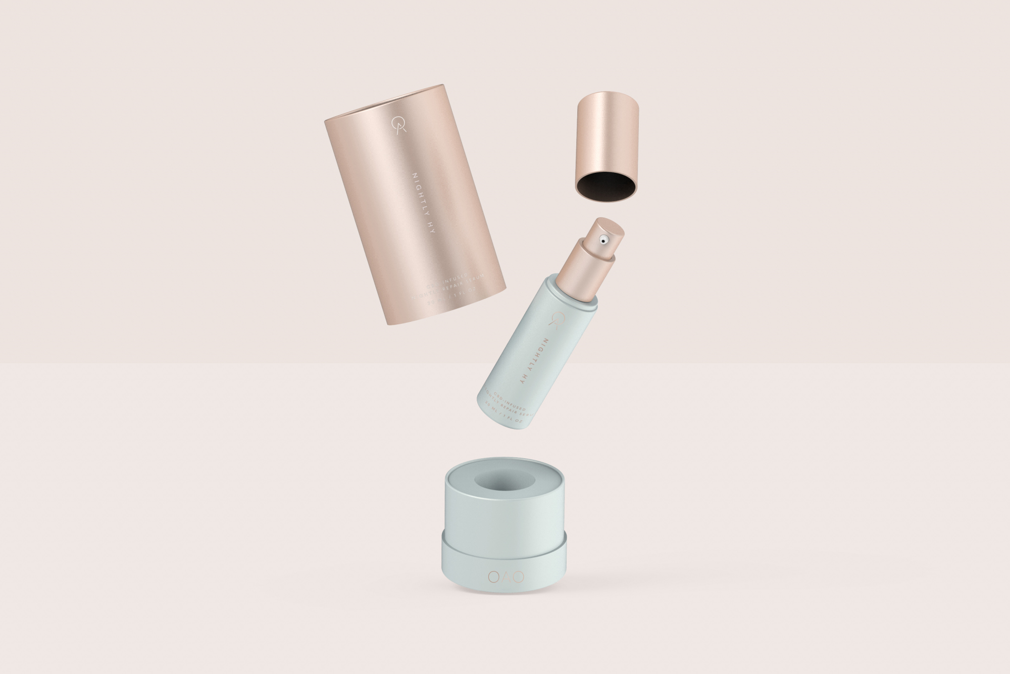
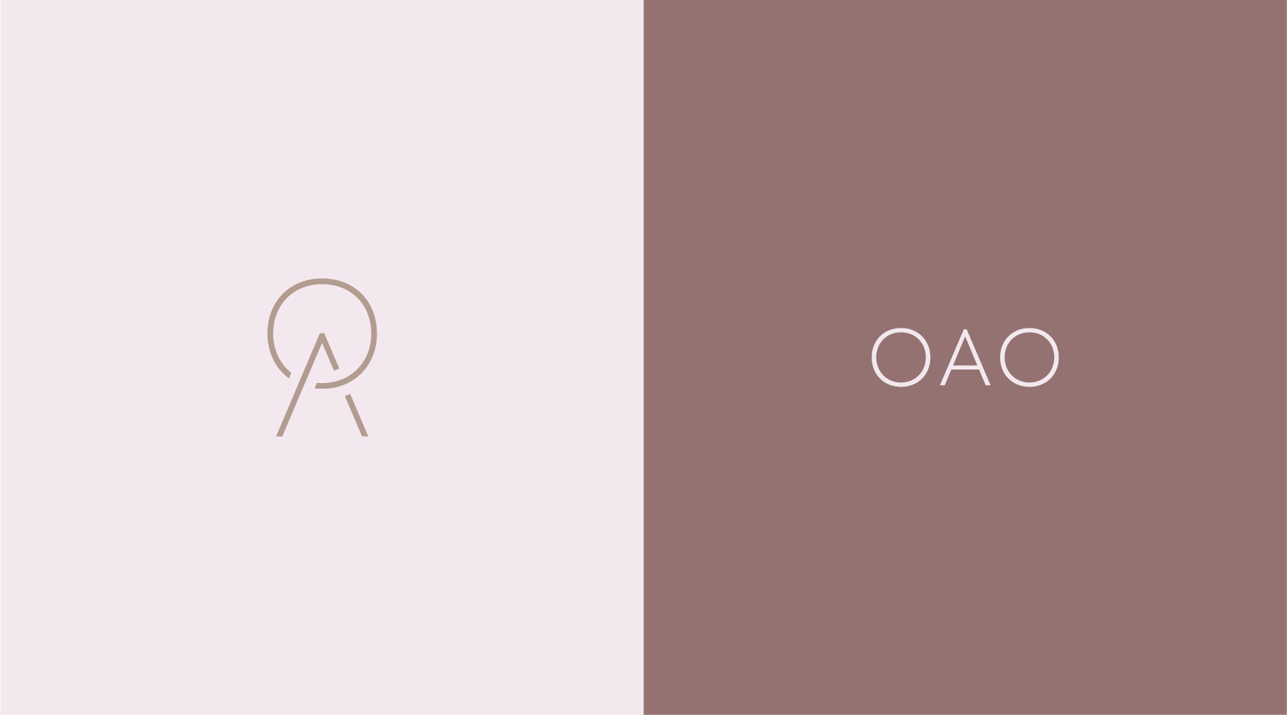
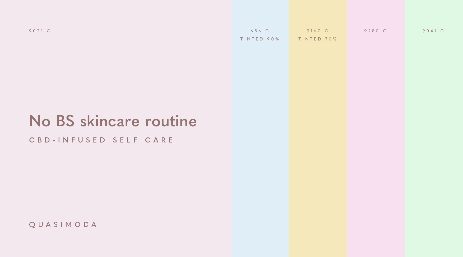
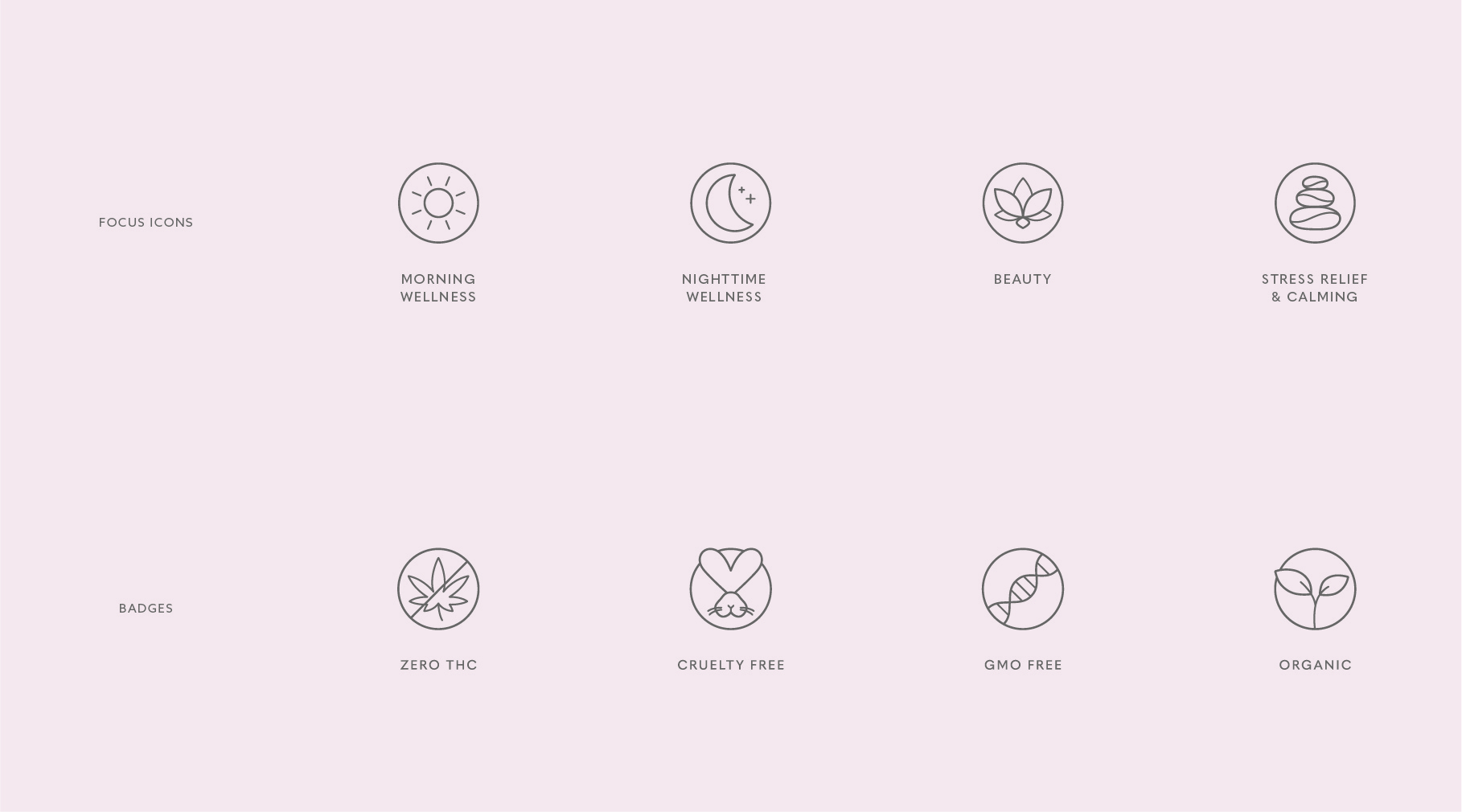
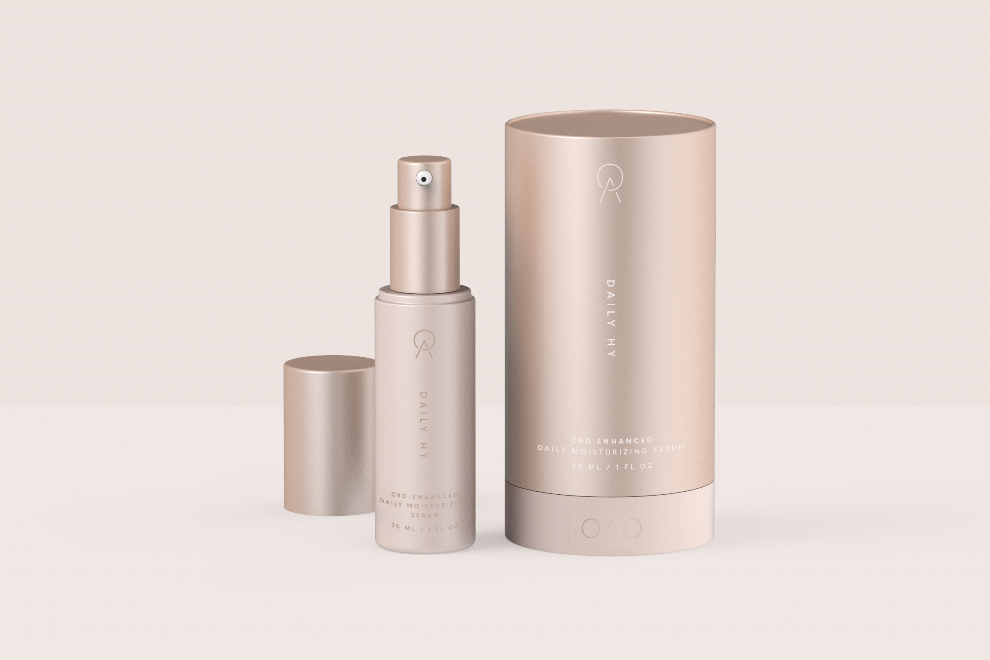
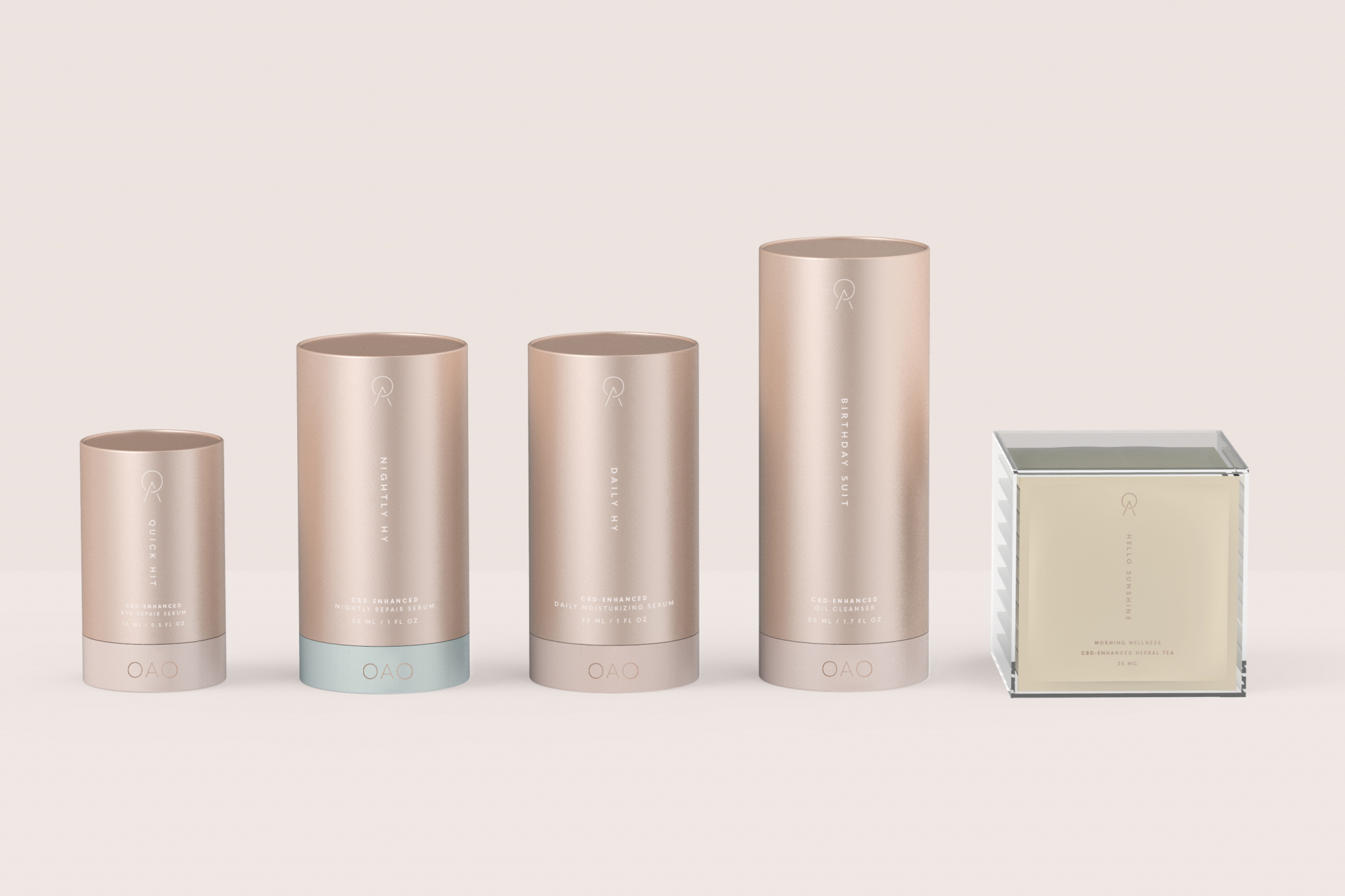
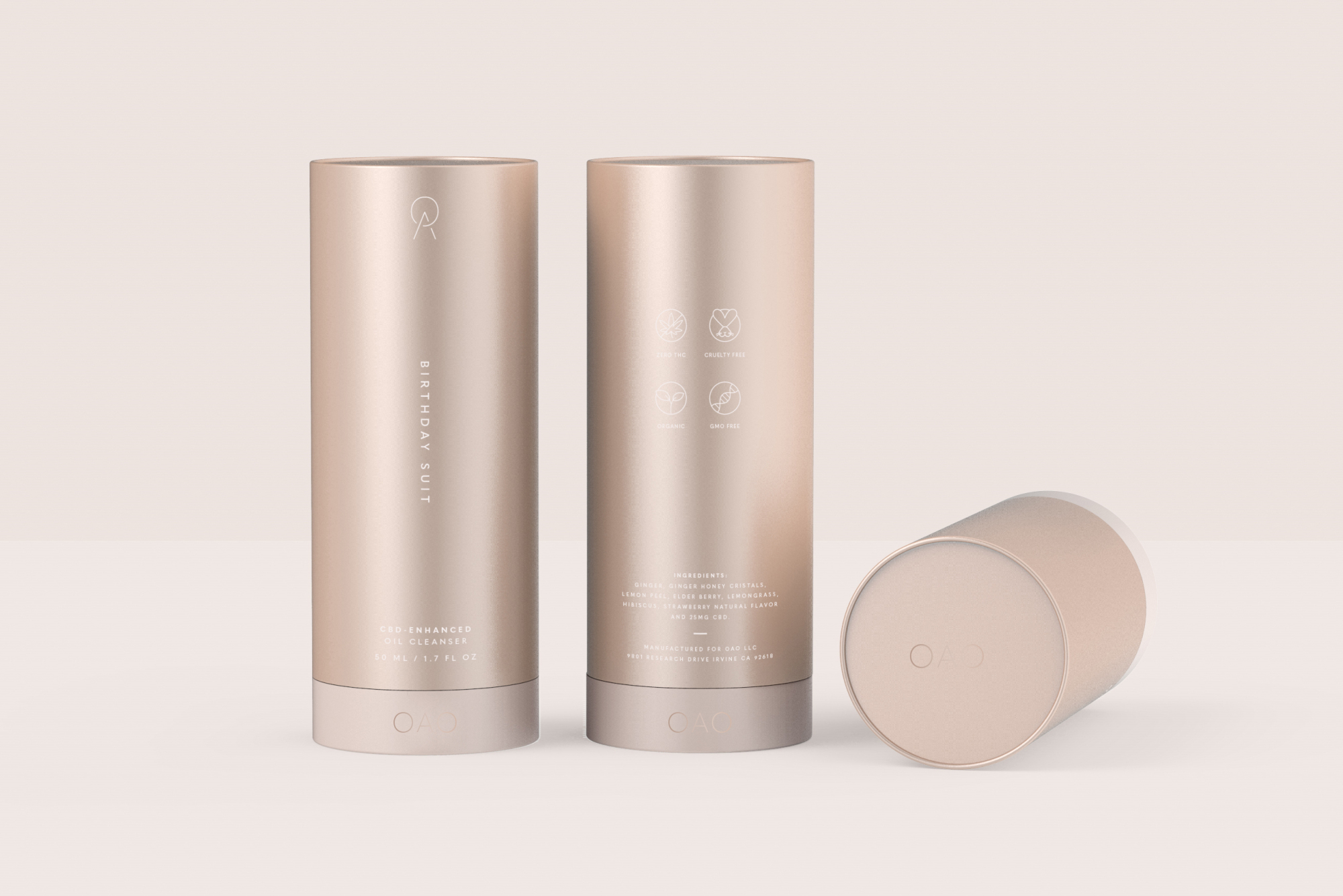
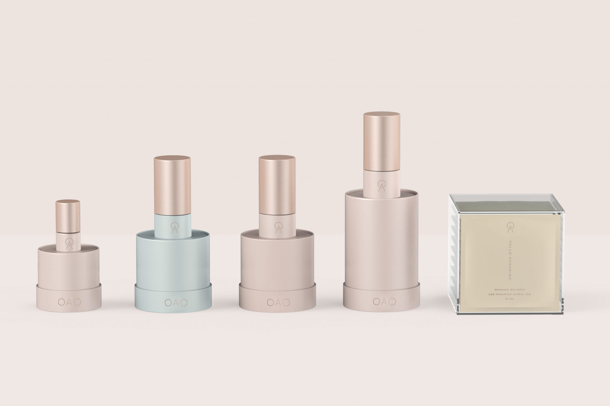
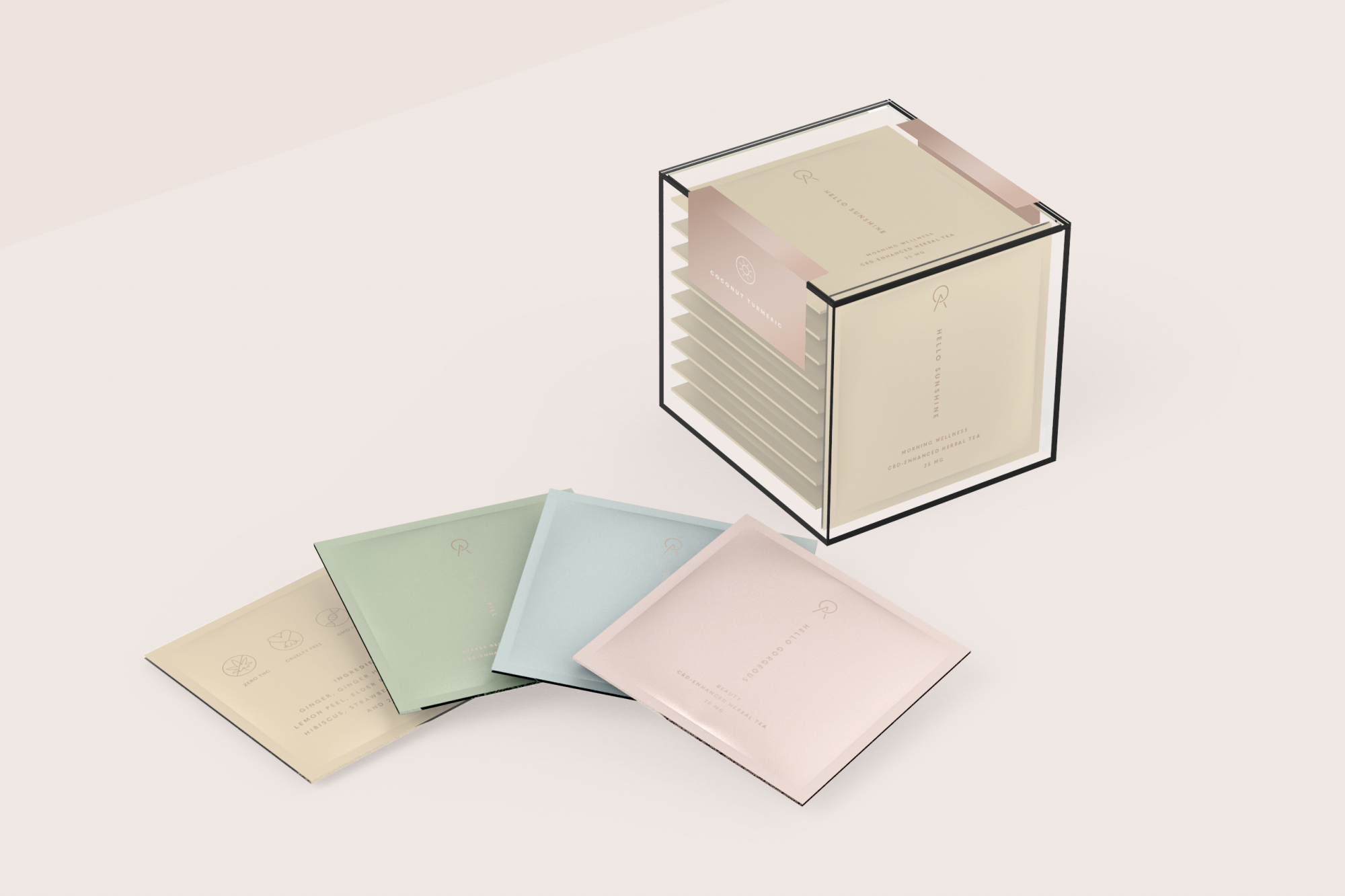
The OAO brand is rooted in the belief of overall health and wellness. When designing the logo, I wanted it to embody modernism, yet represent balance and simplicity, much like their skincare routine. Within the pastel color palette, the blue represents night time; yellow represents morning wellness; pink represents beauty; green represents stress relief and calming. Paired with the use of rose gold, the soft palette attracts the desired female clientele. Custom iconography was used to further depict product function and regulatory information.
The final packaging solution is a cylindrical tube exterior, made with rolled edge paper tube and assembled with inner foam for support, and a clear plastic tex box that securely fits ten pouches. The tubes were designed in varying sizes, each encapsulating a vac-metallized bottle with silk screened graphics. The packaging color scheme was an inverse design. The exterior incorporates matte rose gold foil and the interior bottle and tea bags match the product function.